Glitch Gods: How Vaporwave Crawled Out of the Internet's Basement and Into Your Favorite Luxury Brand
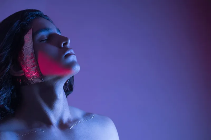
There's a particular image that keeps showing up everywhere right now. Marble columns. Sunset gradients bleeding from pink into purple. A Roman bust wearing sunglasses. Japanese kanji floating over a grid that recedes into infinity. If you've spent more than fifteen minutes on the internet in the last decade, you know exactly what you're looking at. That's vaporwave — the aesthetic that was literally designed to make fun of consumerism — and somehow, against all logic, it's become the hottest visual language in rooms where people spend $4,000 on a jacket without blinking.
Welcome to 2024, where irony is currency and the weirder something is, the faster luxury brands want to slap their logo on it.
What Even Is Vaporwave, For the Uninitiated
Before we get into the fashion world's collective identity crisis, let's do a quick rewind. Vaporwave emerged in the early 2010s as a micro-genre of music — artists like Macintosh Plus and 2814 were chopping up smooth jazz, 80s R&B, and elevator music, slowing it down to a narcotic crawl, and uploading it to Bandcamp under deliberately absurd names. The visuals that came with it were equally unhinged: corrupted computer graphics, Windows 95 screensavers, Greco-Roman statues rendered in neon, and the kind of mall imagery that feels like a fever dream of American consumerism at its most hollow.
The whole thing was a critique. A pretty sharp one, actually. It took the sanitized, optimistic aesthetic of late-capitalism's peak years and ran it through a blender until it looked like a beautiful corpse. It was weird. It was funny. It was deeply, deliberately artificial. And for a while, it lived exactly where it belonged — in obscure corners of Reddit and Tumblr, beloved by people who thought the joke was too niche to ever go mainstream.
They were wrong.
The Runway Doesn't Know It's the Punchline
Sometime around 2022, something shifted. Designers — particularly younger ones working at legacy houses trying to shake off their stuffiness — started pulling from a visual vocabulary that would've been instantly recognizable to any vaporwave fan. We're talking color palettes drenched in magenta and teal, holographic fabrics that look like they were rendered by a 1997 graphics card, and structural silhouettes that feel simultaneously futuristic and deeply retro.
Valentino's pink-saturated collections sent the internet into a spiral of comparisons. Versace's ongoing love affair with maximalist, almost satirically loud patterns started reading less like Italian heritage and more like an A E S T H E T I C meme from 2014. Even more understated brands started flirting with gradient-drenched campaign photography that could've been lifted straight from a vaporwave album cover.
Creative director and independent fashion commentator Dani Reyes, who runs one of the more thoughtful fashion newsletters out of Los Angeles, put it bluntly in a recent post: "These brands aren't necessarily citing vaporwave directly. But the visual DNA is everywhere. The ironic nostalgia, the hyper-artificial color, the way everything feels like a memory of something that never quite existed — that's textbook vaporwave, whether the creative directors admit it or not."
Corporate Branding Caught the Glitch
It's not just haute couture. Look at how major brands have been redesigning their visual identities over the past couple of years. There's been a notable drift away from the clean, flat minimalism that dominated the 2010s — the era of every logo becoming a sans-serif whisper — toward something with more texture, more chromatic weirdness, more deliberate artificiality.
Streaming platforms, gaming companies, and even some food and beverage brands have been quietly pulling from an aesthetic toolkit that has vaporwave fingerprints all over it. The retro-futurism, the sense that everything is slightly corrupted or oversaturated, the nostalgic references to tech that's already obsolete — it's all there.
The wild irony is that vaporwave was, at its core, a takedown of exactly this kind of corporate visual language. It was made by people who found the cheerful emptiness of 80s and 90s commercial aesthetics both hilarious and horrifying. Now the corporations have absorbed the critique and turned it into branding. Which is, if you think about it, the most vaporwave outcome imaginable.
Why Now? Why This?
So what's actually driving this? A few things are converging at once.
First, there's the Gen Z and elder millennial nostalgia machine. People who grew up online in the 2010s are now in their mid-to-late twenties and thirties, and they have spending power. The aesthetics they encountered during formative years — including the weird internet rabbit holes where vaporwave lived — carry genuine emotional weight for them, even if that weight is wrapped in layers of irony.
Second, there's a broader counter-reaction happening against the sterile minimalism that's dominated design for the past decade. The all-white everything, the neutral tones, the quiet luxury aesthetic — people are getting bored. Vaporwave's maximalism, its willingness to be aggressively artificial and visually loud, feels like a genuine relief.
Third — and this is the part that would probably horrify the original vaporwave artists — it photographs beautifully. The gradient-heavy, high-contrast, slightly surreal visual language is absolutely engineered for Instagram and TikTok. Whether that was ever the intention is beside the point. The algorithm loves it.
The Artists Who Started It All Are... Conflicted
Reach out to anyone who was making vaporwave music and art in its early days and you'll get a complicated mix of reactions to its current mainstream moment. Some are genuinely thrilled that a weird little internet microculture got to have a second life. Others are watching luxury brands absorb their aesthetic with the particular exhaustion of someone who's seen this movie before.
One independent visual artist and longtime vaporwave creator who goes by the handle Holographic Leisure and asked to keep their real name out of it told us via DM: "The whole point was that the aesthetic was supposed to feel cheap and disposable and fake. Seeing it on a $3,000 coat is genuinely funny to me. Like, yeah, you nailed it. That IS the joke. You just don't know you're making it."
That's kind of the perfect encapsulation of where we are right now. The luxury fashion world has adopted a visual language built to critique luxury fashion, and both things are simultaneously true and somehow fine.
What Comes Next
Aesthetics move fast, and vaporwave's mainstream moment will eventually crest and recede like everything else. But the fact that it made it this far — from obscure Bandcamp uploads and Tumblr art blogs to actual runways and brand identity decks — says something interesting about how cultural influence actually works in the internet age.
Weird stuff doesn't stay contained anymore. The most niche, most self-referential, most deliberately anti-commercial creative movements can go from underground joke to luxury inspiration in less than a decade. The walls between subculture and mainstream have essentially dissolved, which is either exciting or deeply unsettling depending on how you feel about irony being sold back to you at a markup.
Either way, the next time you see a magenta-and-teal gradient on a billboard or a marble statue rendered in neon on a designer lookbook, pour one out for the weird little internet genre that accidentally became the visual language of an era. It would've found that extremely funny. It still kind of does.